String X or Y ticks label in plotting graph of Python using matplotlib
In usual case, we are plotting graphs about integer or float x or y values, but sometimes you need to plot some graphs using string x or y values such as dates, categories.
In this case, you can easily draw plot with string values by using xticks or yticks module.
In this post, I will show you an example using x string values.
Just for integer plot
-----------------------------------------------------------------------------
from pylab import *
x = [ 1, 2, 3 ]
y = [ 2, 5, 10 ]
plot(x, y)
show()
-----------------------------------------------------------------------------
The results is like below

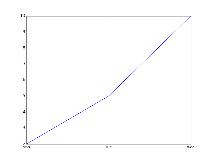
Now, for string x values
---------------------------------------------------------------------
from pylab import *
x = [ 'Mon', 'Tue', 'Wed' ]
y = [ 2, 5, 10 ]
plot(range(len(y)), y)
xticks(range(len(y)), x, size='small')
show()
--------------------------------------------------------------------
Eventually, you can get the graph with string x labels described as below
Thanks,
Have Fun!
In this case, you can easily draw plot with string values by using xticks or yticks module.
In this post, I will show you an example using x string values.
Just for integer plot
-----------------------------------------------------------------------------
from pylab import *
x = [ 1, 2, 3 ]
y = [ 2, 5, 10 ]
plot(x, y)
show()
-----------------------------------------------------------------------------
The results is like below
Now, for string x values
---------------------------------------------------------------------
from pylab import *
x = [ 'Mon', 'Tue', 'Wed' ]
y = [ 2, 5, 10 ]
plot(range(len(y)), y)
xticks(range(len(y)), x, size='small')
show()
--------------------------------------------------------------------
Eventually, you can get the graph with string x labels described as below
Thanks,
Have Fun!
댓글
댓글 쓰기